MOORLAND — Brand Identity & Packaging Design
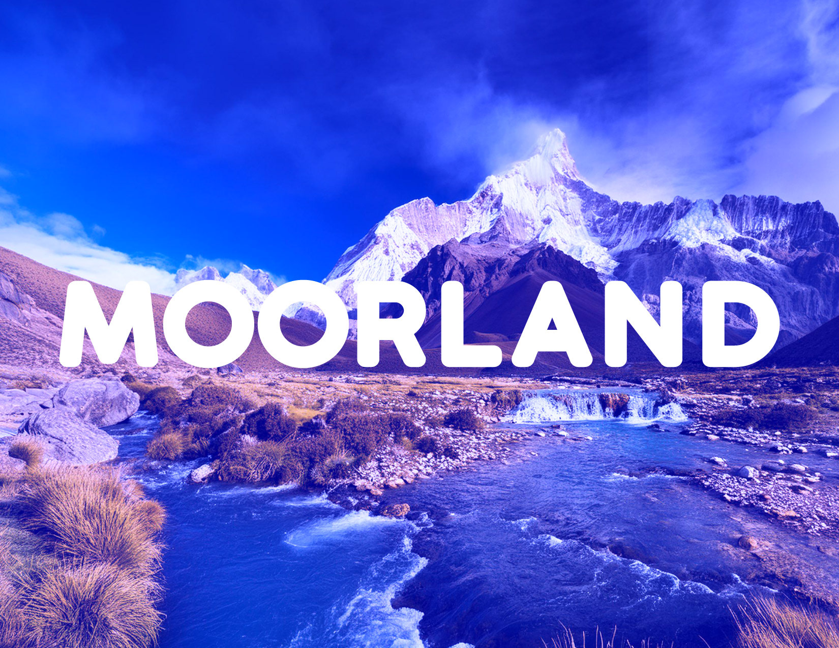
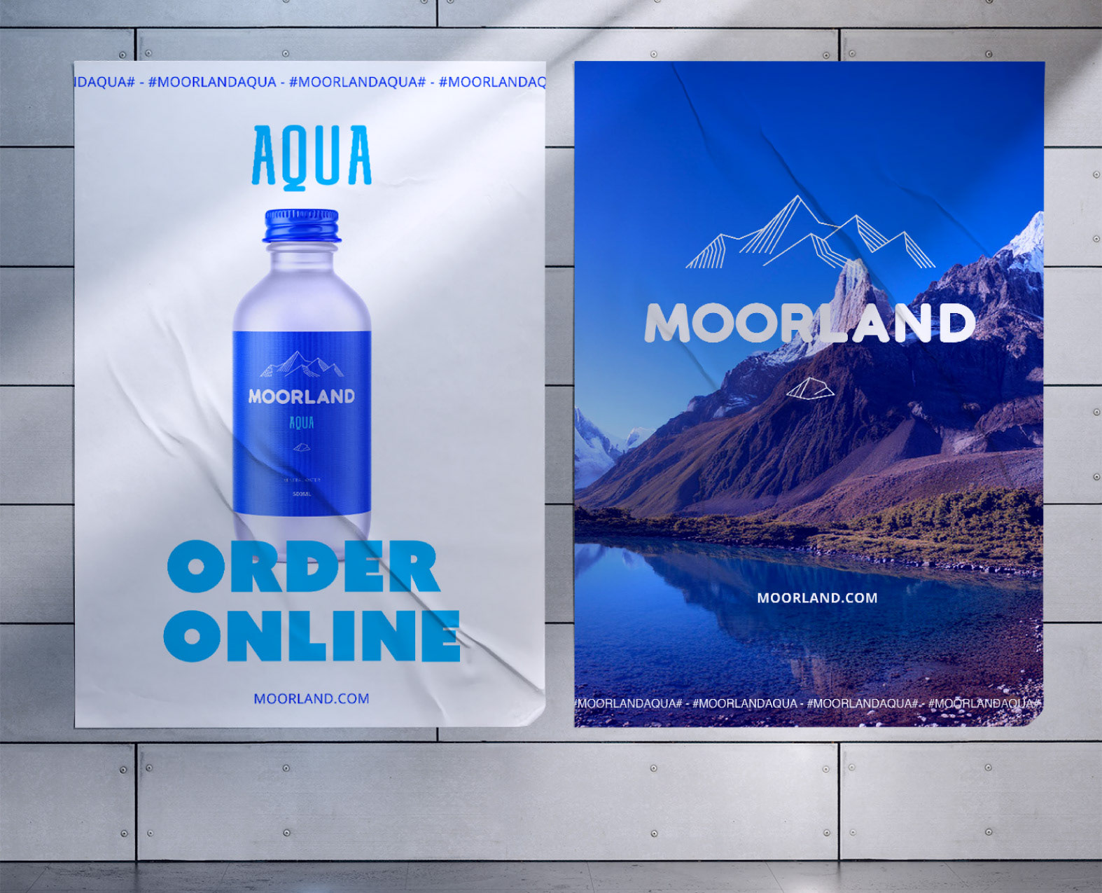
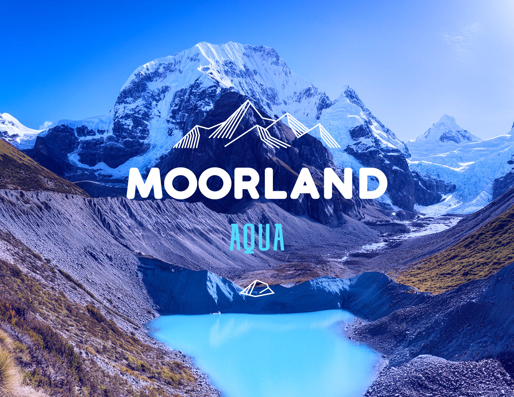
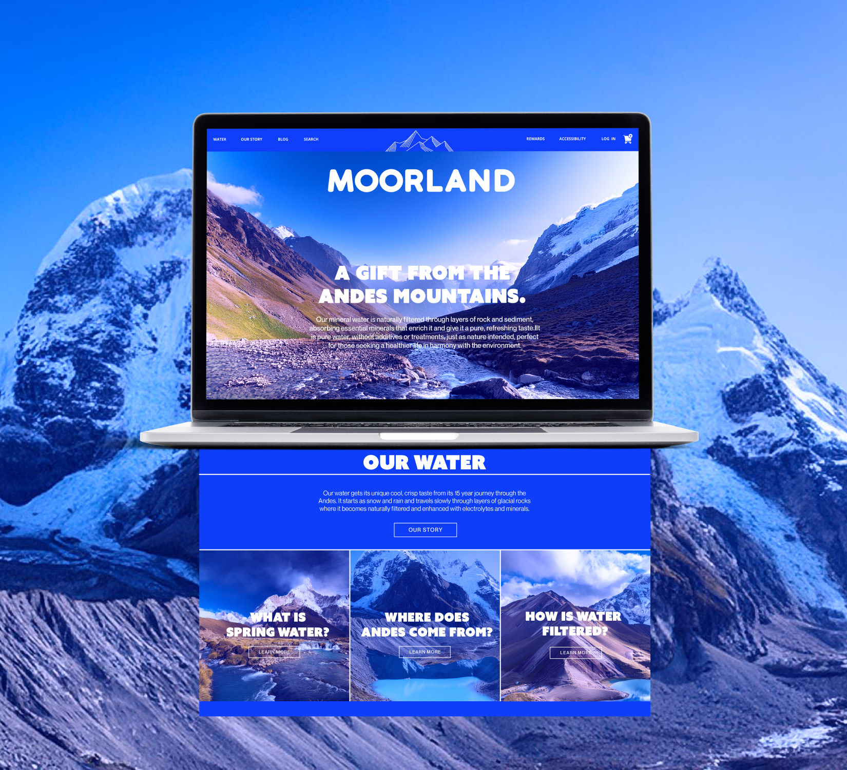
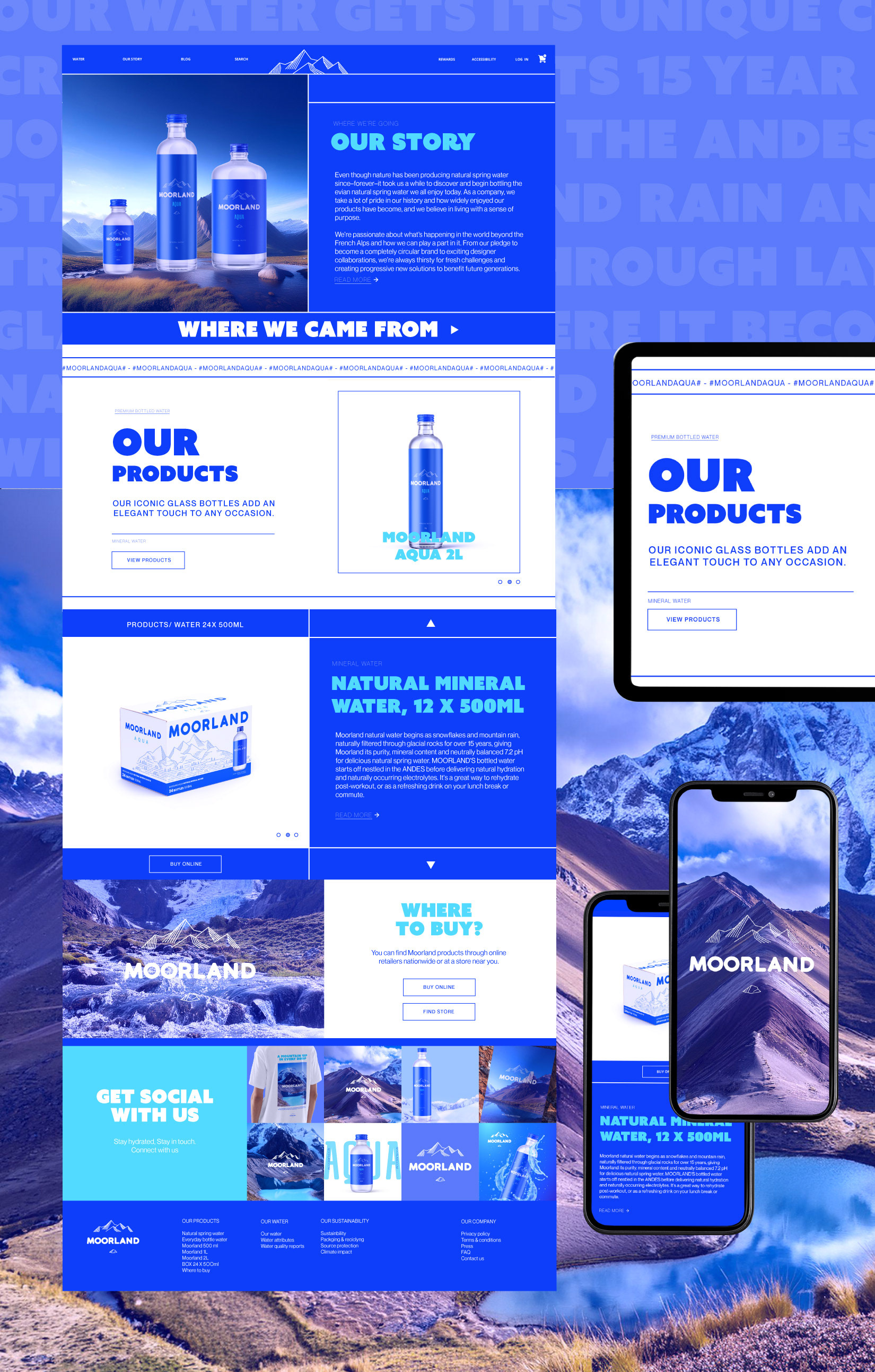
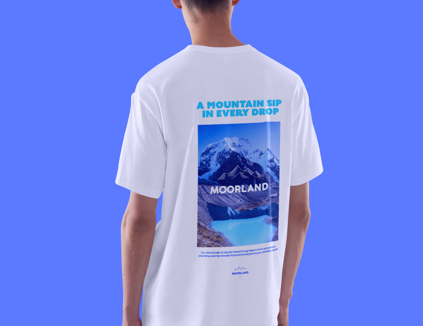
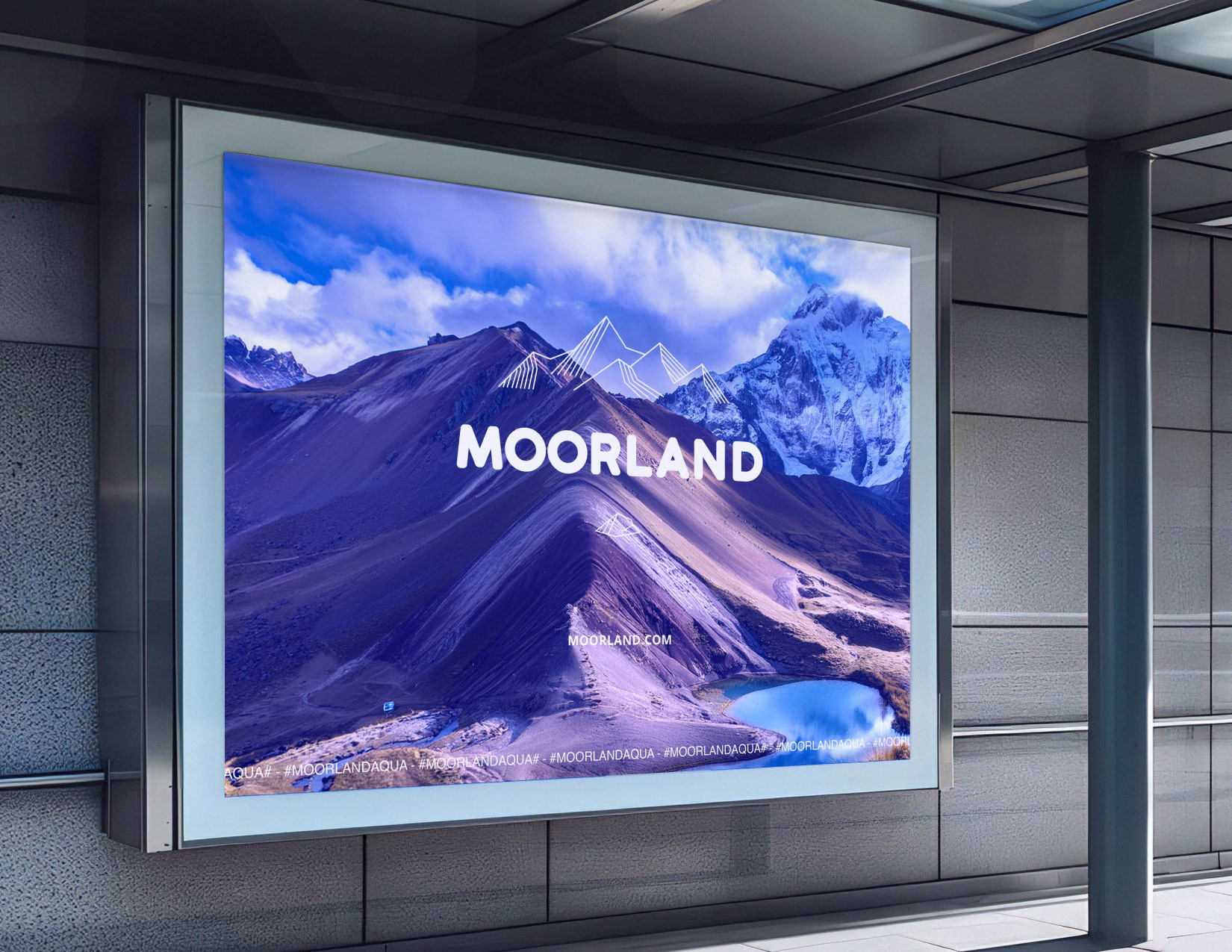
MOORLAND is a premium natural water brand sourced from a rock spring in the Andes Mountains. The project focused on developing a visual identity that communicates purity, freshness, and understated elegance while remaining approachable to a broad audience.
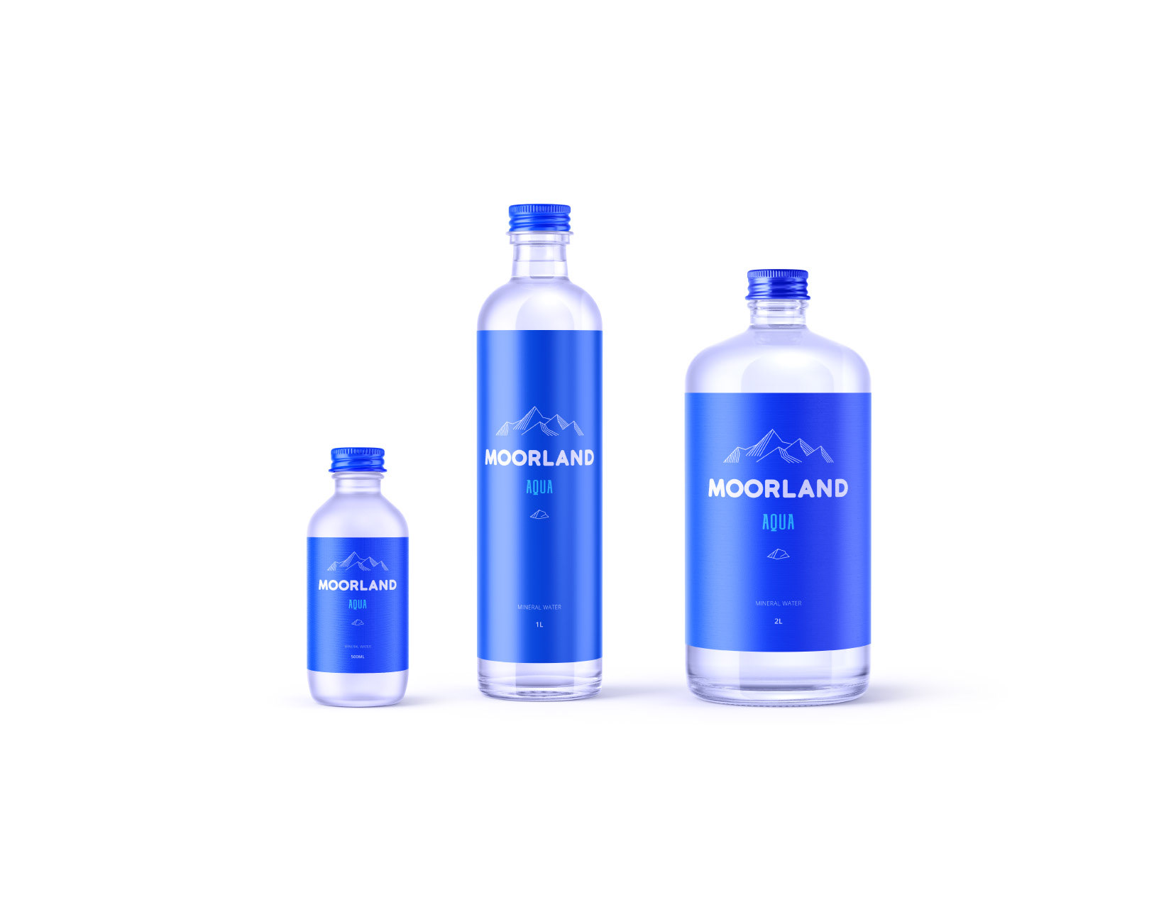
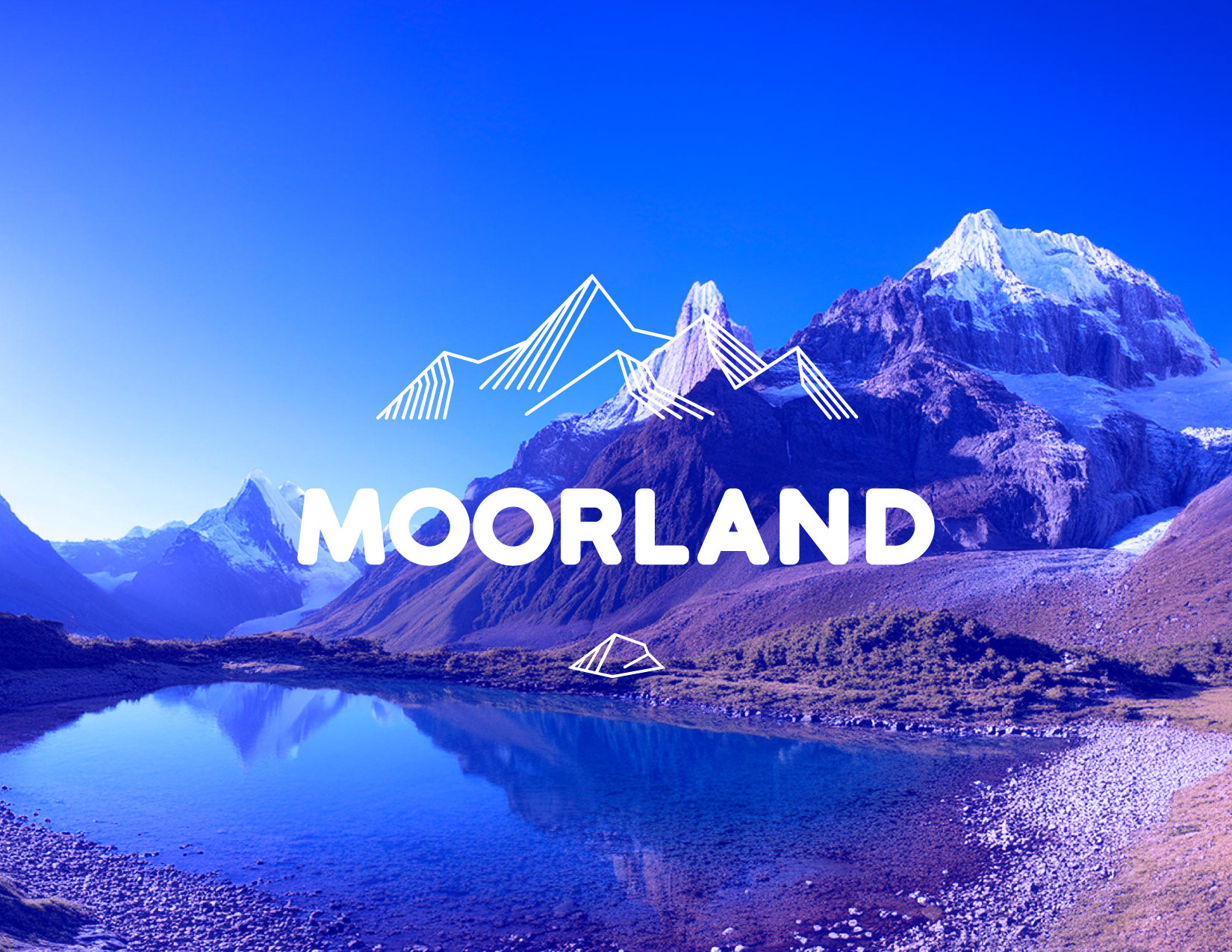
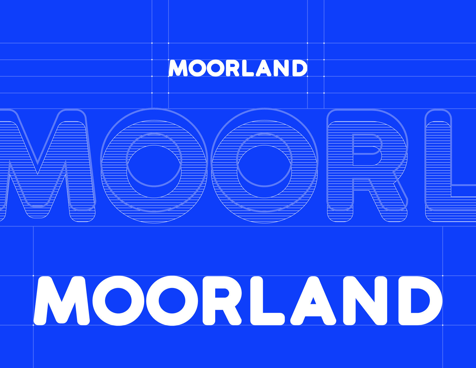
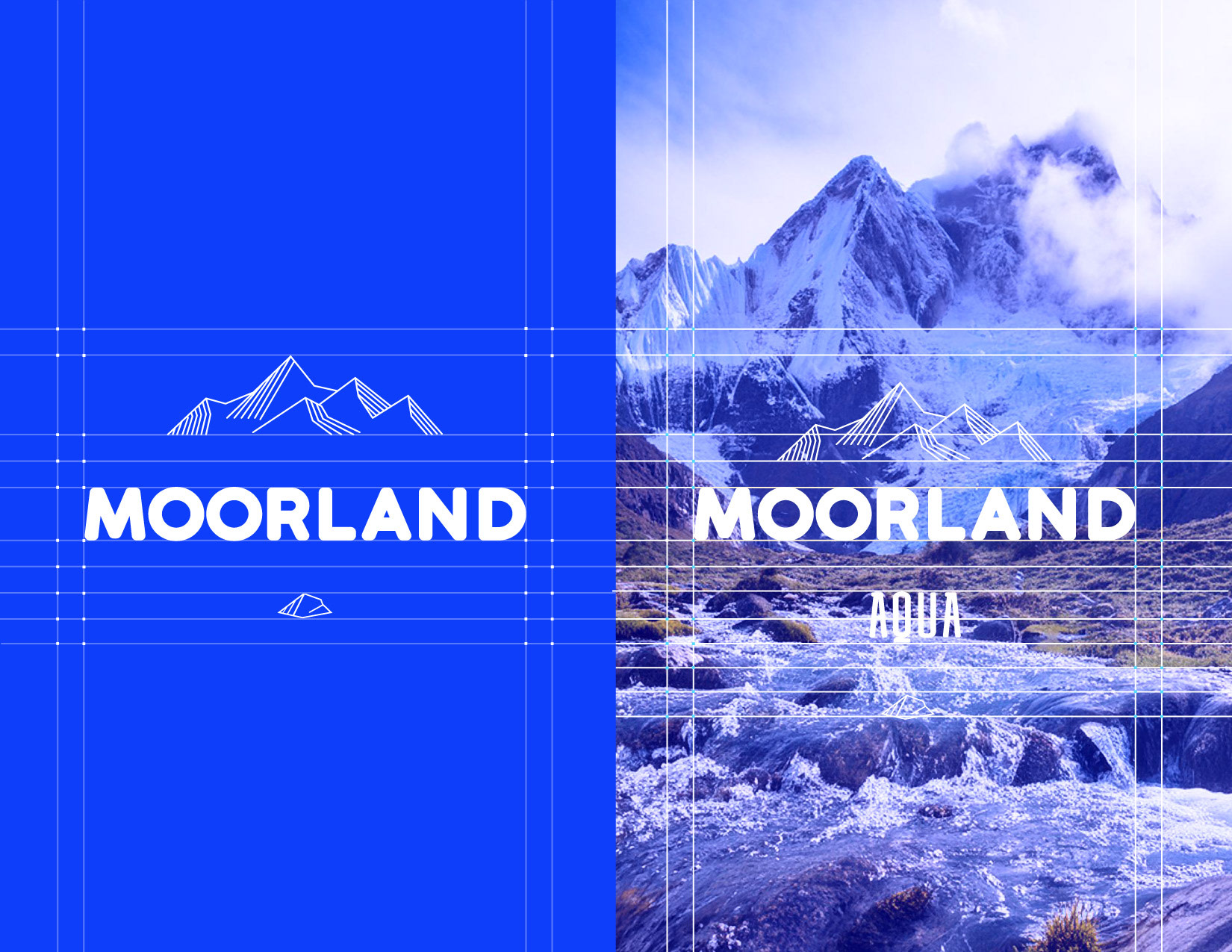
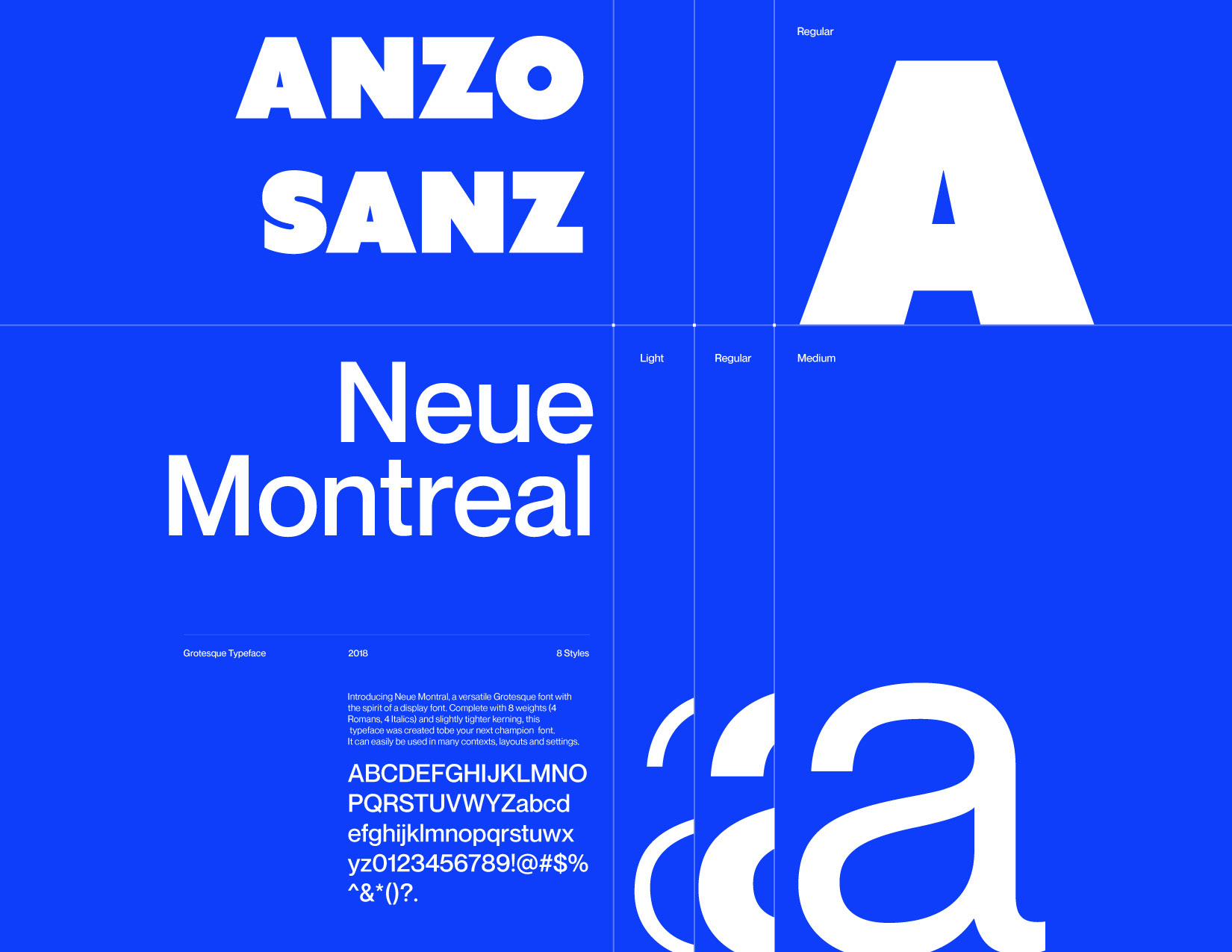
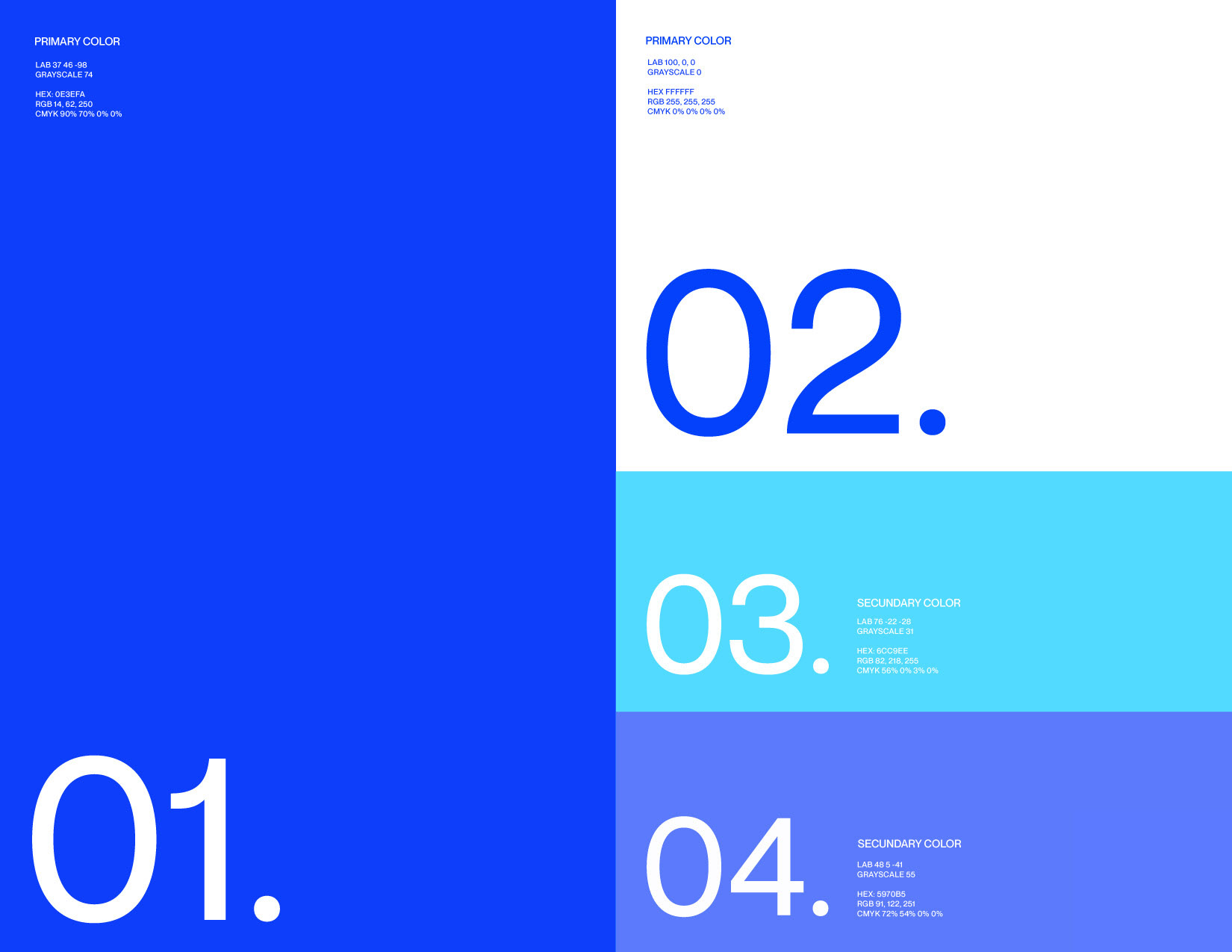
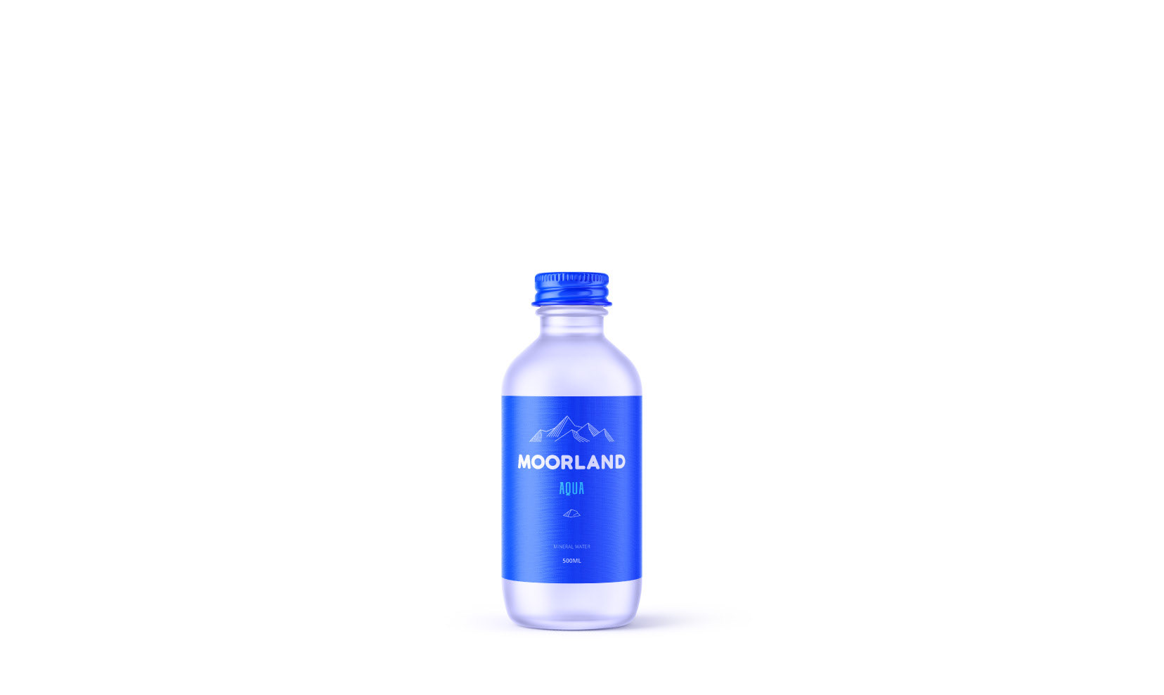
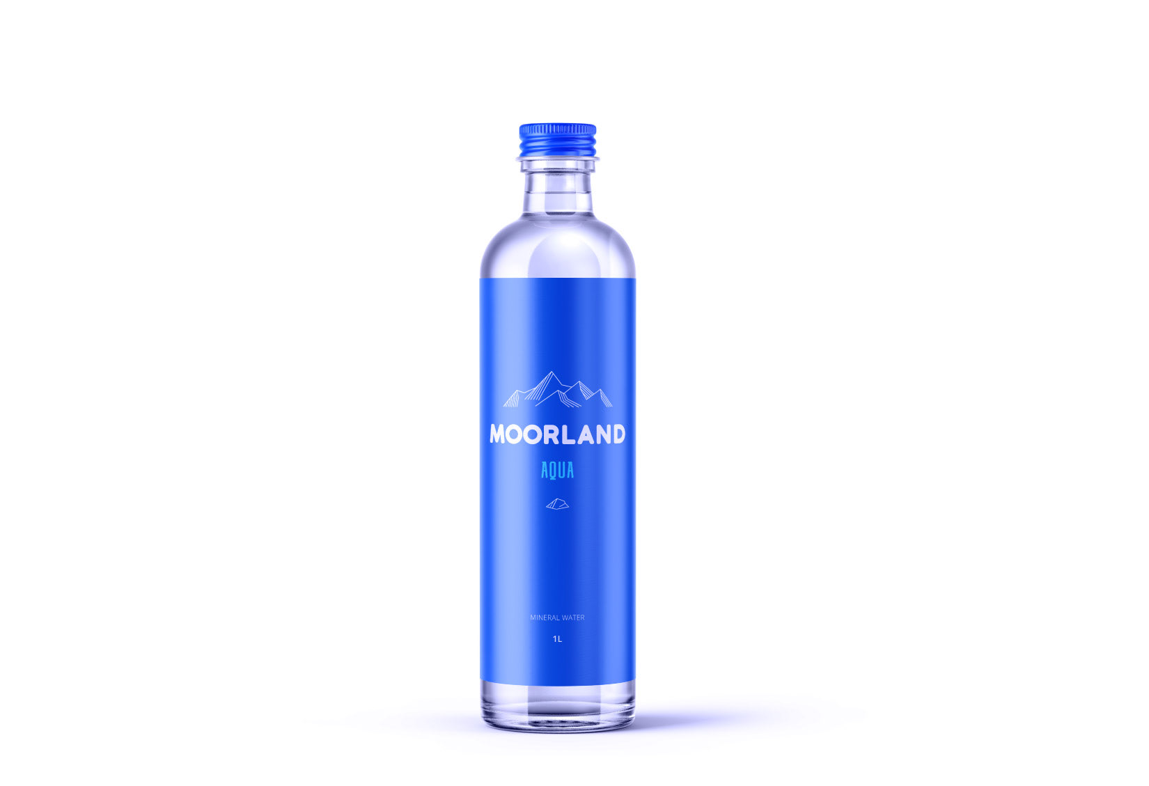
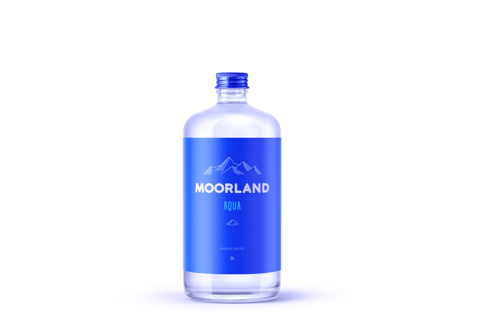
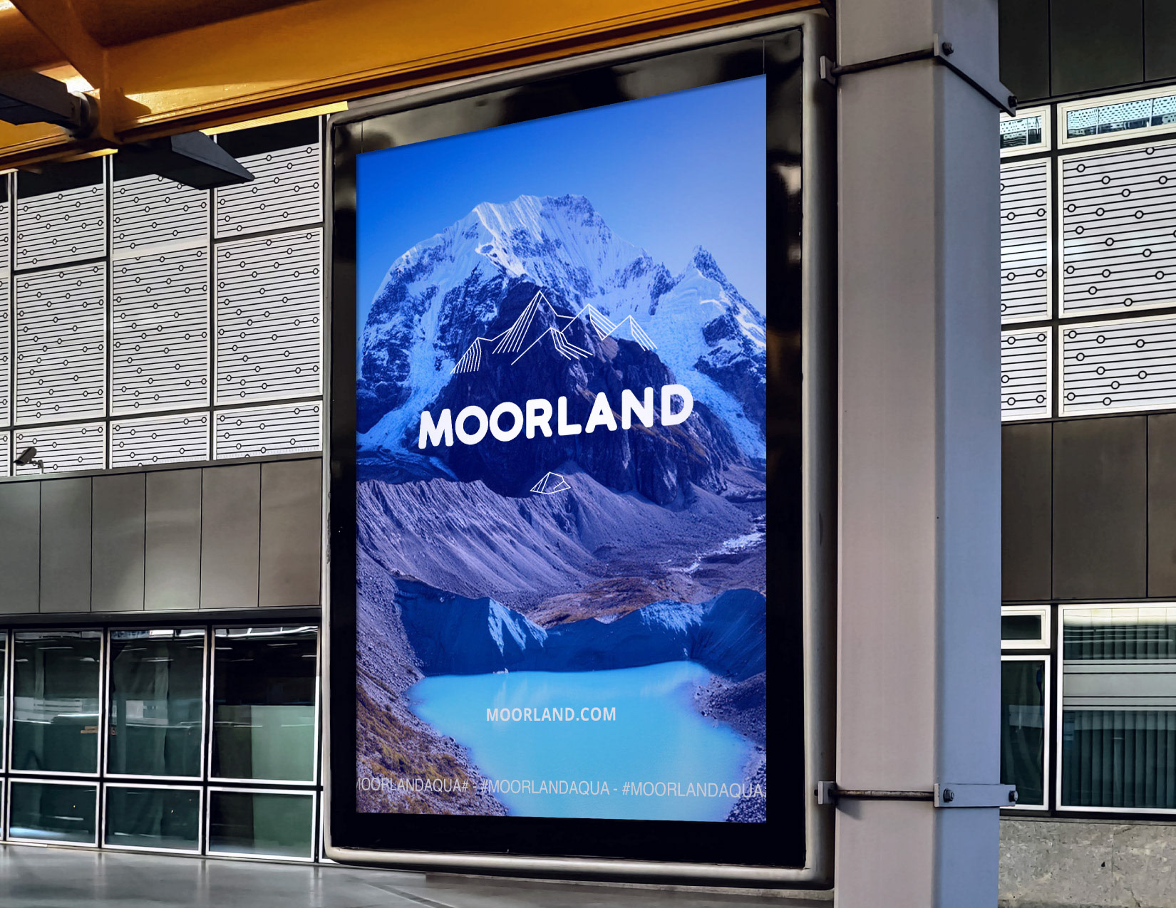
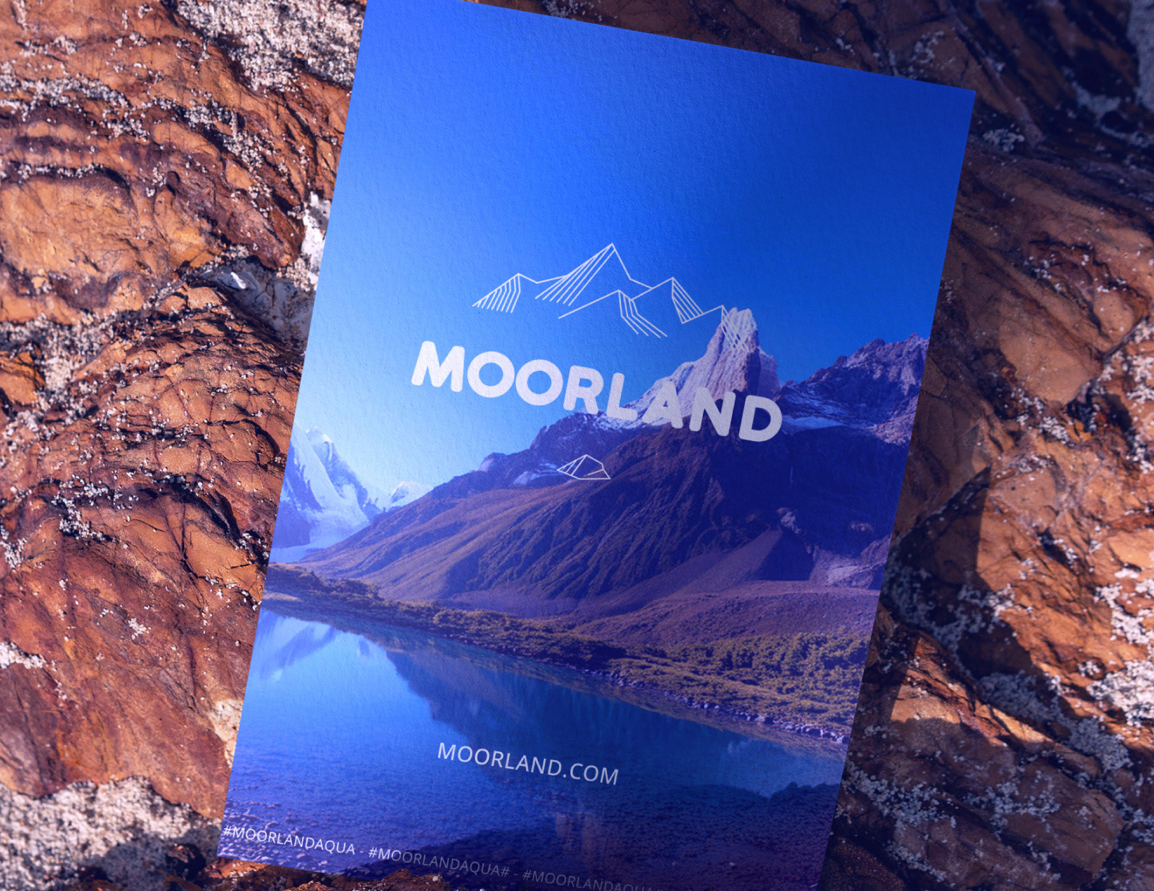
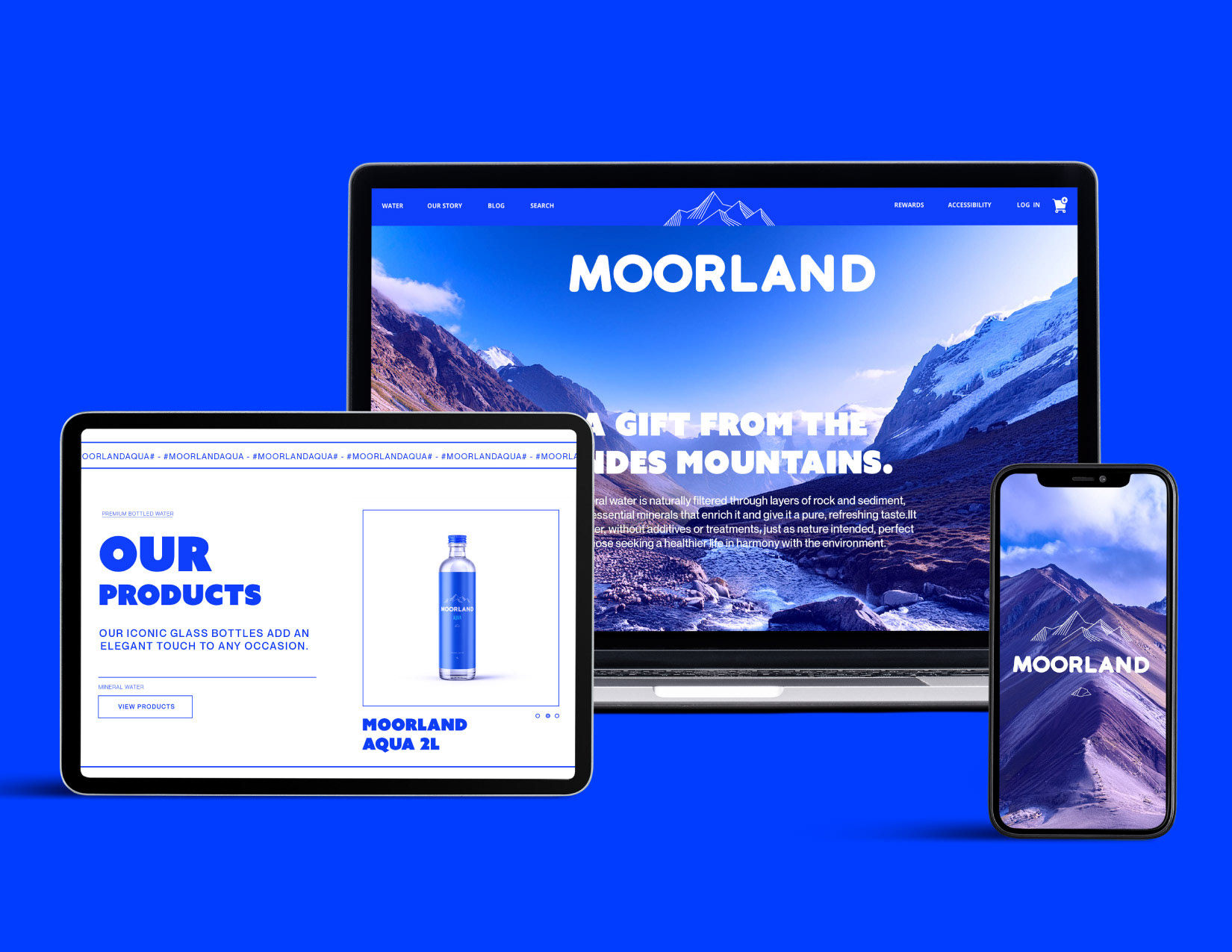
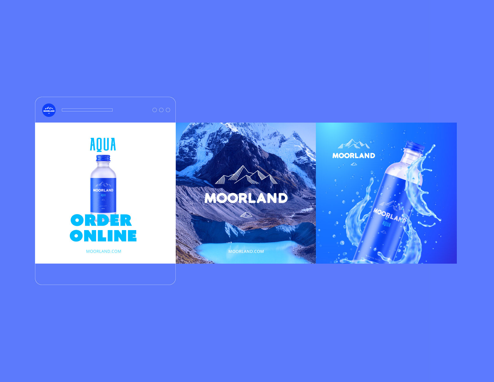
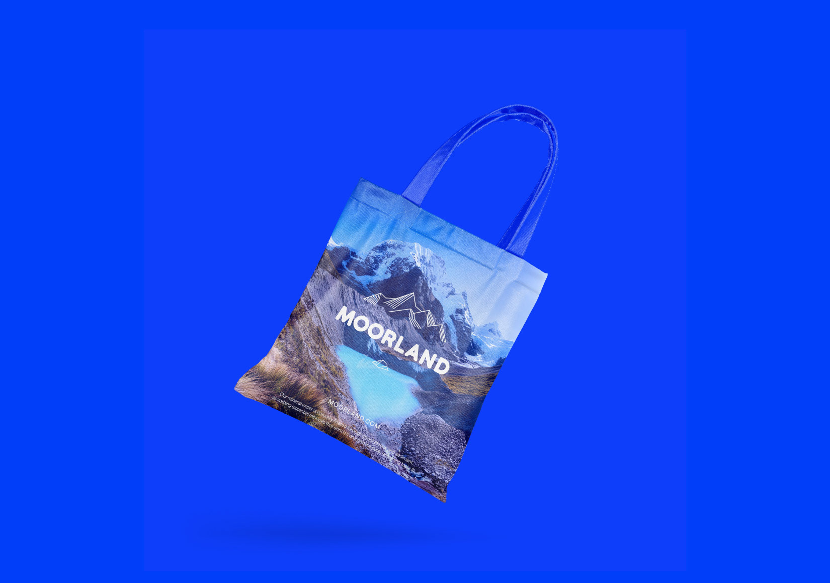
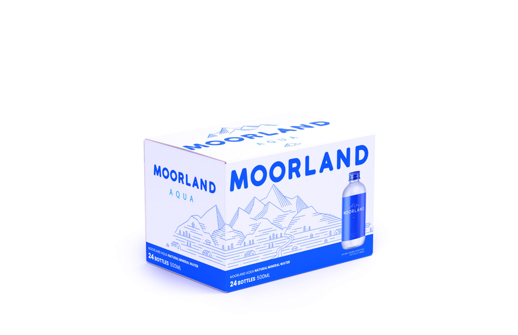
I designed the MOORLAND logo, packaging system, and brand applications using a minimalist visual language inspired by the mountain landscape and the natural origin of the water. Fine lines, clean typography, and a refined colour palette were used to create a distinctive yet cohesive identity across different bottle formats and supporting materials.
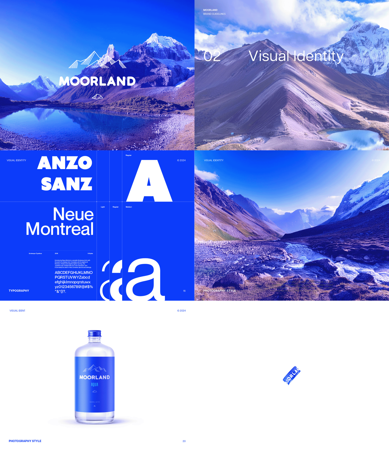
The project also included a complete brand guidelines document outlining the correct use of the logo, typography, colours, packaging, and visual applications to ensure consistency across every brand touchpoint.